In the evolving landscape of healthcare delivery and drug development, patient-centredness is increasingly acknowledged as a cornerstone of quality care. Today's patients are seeking greater autonomy over their health, driven by a desire to understand the complex factors influencing their well-being. This empowerment goes beyond traditional medical protocols, encouraging patients to adopt comprehensive strategies encompassing lifestyle changes and multidisciplinary approaches.
Amidst this shift, there has been a notable surge in the adoption of mindful and health-data collecting strategies, including writing practices, biometric wearables, and mobile health applications (mHealth apps). However, a critical challenge emerges: the abundance of data collected by users often fails to coalesce into comprehensible pieces of information that accurately reflect the multifaceted nature of health and well-being. For this data to be clinically valuable, especially in the context of medical consultations, digital platforms must be adept at synthesising data from diverse sources into dialogue models that are not only informative for clinicians but also to patients.
This essay seeks to delve into and propose design strategies aiming to bridge the communication gap between patients and healthcare providers through agnostic mediums for personal health communication.
State of Health Communication
The establishment of effective communication between patient and doctor is a complex interactional system, fundamental for facilitating the exchange of essential information and elicitation of patient preferences.
Human interaction attributes are a determinant factor in strengthening patients’ trust and satisfaction with healthcare entities and clinicians (Berry et al., 2021), and as patients are increasingly looking to become part of the decision-making process (Naseem, 2018), mutual agreement, empathy, and providing responses that empower patients to participate in making informed choices, and not just remain passive elements, are important assets in establishing a solid foundation for successful clinical journeys rooted in patient-centred care (PCC) (Backman et al., 2019; Langberg et al., 2019; Mikesell, 2013).
Because clinical interactions are widely diverse and individual, visualising such PCC attributes in practice might be a bit abstract. Perhaps they become more tangible though, if we reflect for a moment on an episode discussing for the first time a group of physical or mental symptoms with a doctor. How prepared were you to describe your symptoms? Did you manage to articulate them clearly, or did you struggle to convey them accurately on the spot? As the doctor inquired, did you feel your responses accurately captured the full extent of your health concerns? Was there a sense of mutual understanding achieved, or were there moments where the nuances of your experience got lost in verbal communication? These few questions highlight some of the potential barriers in patient-doctor dialogues, especially when confronting new or less linear health issues. Such interactions often leave patients wondering if they could express themselves clearly without missing important facts and if their doctors truly grasped the entirety of their concerns.
These communication challenges are inherent to any interaction model that relies heavily on verbal communication. As such, they are well-documented and somewhat anticipated. By adhering to key patient interaction guidelines, behavior-dependent limitations can be mitigated with a reasonable degree of confidence (Barsky, 2002; Laurence K., 2021). Despite these efforts, research in cognitive psychology highlights that human memory is often subject to inconsistencies, particularly in recalling events telescoped in time, leaving cognitive-dependent variables largely beyond control (Coughlin, 1990; Solga, 2001; Barsky, 2002; Jaspers et al., 2009). It is commonly observed that patients’ recollections of past symptoms, illnesses, and medical care are often inconsistent across inquiries at different times (Barsky, 2002; Zaremba et al., 2018), leading to challenges in accurately articulating variations in symptom intensity and frequency. Additionally, patients frequently forget or underreport previous symptoms and events due to simple memory gaps, or merge separate, similar occurrences into a single, generalised memory. This process, known as memory consolidation, can result in the false recall of events and symptoms that did not occur, potentially leading to misleading accounts. Furthermore, the accuracy of recalling past medical events is influenced by various factors, including personality traits and the patient’s current emotional and physical state at the time of recall (current state bias). For example, patients experiencing anxiety, depression, pain, or bodily distress may emphasise events that might not have been recalled in a more comfortable and familiar environment (Barsky, 2002).”
Recognising the inherent limitations of memory recall, the medical community has long relied on patient diaries as a practical tool for tracking health metrics and symptoms. These diaries serve as a tangible method for capturing quantifiable data, such as blood pressure, weight, and emotional states, while also providing space for patients to record symptoms as they occur. By grounding observations in real-time documentation, patient diaries help to mitigate the inaccuracies of retrospective recall, offering healthcare providers a clearer picture of patterns and potential triggers. However, as health-tracking moves into the digital realm, mHealth apps have emerged as modern alternatives, promising convenience and advanced functionality, but not without their own set of challenges.
Why Do mHealth Apps Fail?
Despite the promise of mHealth apps and a growing willingness among users to adopt them, significant challenges persist. One of the most pressing issues is the inadequate user comprehension of health information generated in consumer apps, which undermines their effectiveness (Rowland et al., 2020). This is evident in the low adherence rates, with many users abandoning health-tracking devices shortly after initial engagement (Meyerowitz-Katz et al., 2020). Furthermore, factors like user motivation, pre-existing health conditions, and human-computer interaction (HCI) attributes, such as information visualisation literacy, perceived usefulness, ease of use, and satisfaction with the information systems, play a critical role in sustained engagement (Vaghefi, 2019).
To explore these limitations and objectively trace information-supportive dynamics, I conducted an evaluation of selected leading health apps, complemented by user feedback. This assessment revealed recurring themes and highlighted interface challenges from both theoretical and practical perspectives. From these insights, I inferred speculative design experiments aimed at answering a broad yet defining question: How might raw data be transformed into a vivid, pictorial narrative of the self?
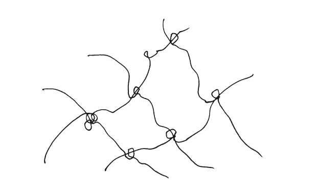
For the things of the world are their stories, identified by their paths of movement in an unfolding field of relations. Things occur where things meet, occurrences intertwine, as each becomes bound up in the other's story. It is in such binding that knowledge is generated.
(Ingold, 2011, 159)

Occurrences interwining, Ingold, T., 2011. Being alive: essays on movement, knowledge and description. Routledge, London ; New York.
The Fragmentation of Health Data
A common limitation of popular health-tracking apps is their inability to present information within a broader context. While many excel at data collection, they often fail to integrate diverse datasets effectively, preventing users from obtaining a broad and comprehensive overview of their health information (Yao et al., 2019).
Although intuitive infographics can effectively communicate specific domains, the inability to integrate multivariate data visualisation within a single graph limits the user’s ability to uncover meaningful correlations between overlapping events. For instance, a monthly view of rosacea symptoms may provide insights into their frequency and severity. However, layering or juxtaposing a second variable, such as emotional or stress levels, onto the same timeline allows disparate health metrics to converge, shaping a new context with potentially valuable correlations that enhance the user’s comprehension.
Building such contextual views supports the creation of coherent mental models, enabling users to better understand how different events and experiences are interconnected over time. By situating these variables within a shared timeline, users can interpret how the sequencing and relationships between factors influence their health. This contextualised visualisation not only allows them to explore potential correlations and patterns that might otherwise remain hidden but also facilitates more effective personal insights and enhances communication with healthcare providers, fostering a more comprehensive understanding of their health experiences.
— Data abundance doesn’t ensure better understanding. Excessive data volumes can result in confusion, anxiety, and eventually, resource inoperability.
This challenge is compounded when users rely on multiple apps to manage their health, each specialising in a narrow domain. For instance, one app might track dietary intake while another logs symptoms, but without interoperability, users are left to manually correlate these data points. This fragmented experience detracts from the effectiveness of these tools, making it harder for users to uncover patterns and manage conditions efficiently.

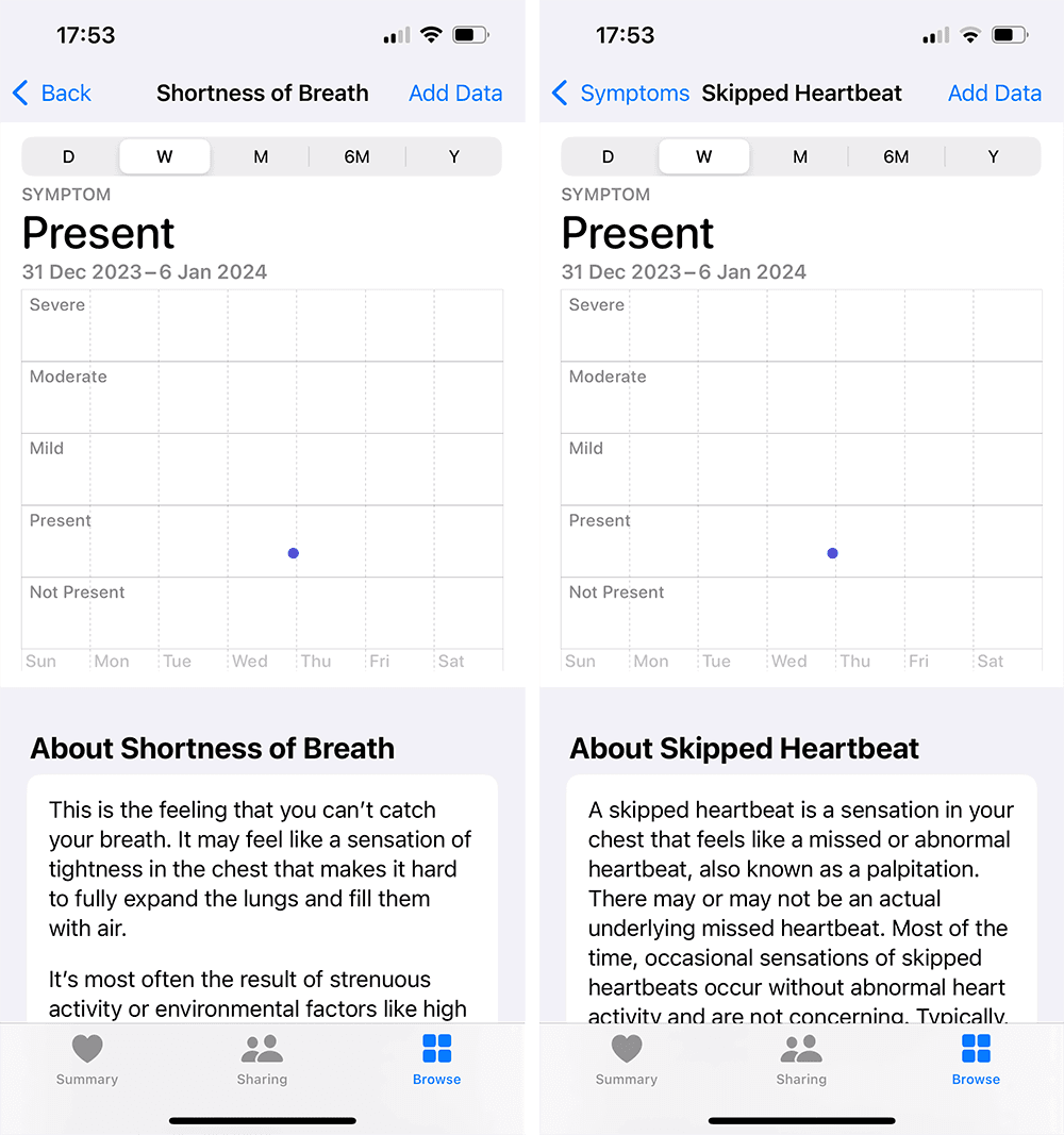
The Apple Health app displays symptoms in isolated views, requiring multiple steps of navigation to access each symptom individually. This fragmented design prevents users from viewing symptoms in context with one another, making it difficult to identify correlations or patterns across symptoms. The lack of an integrated view limits a comprehensive overview into health trends and adds unnecessary complexity to the navigation flow.
Visualising time
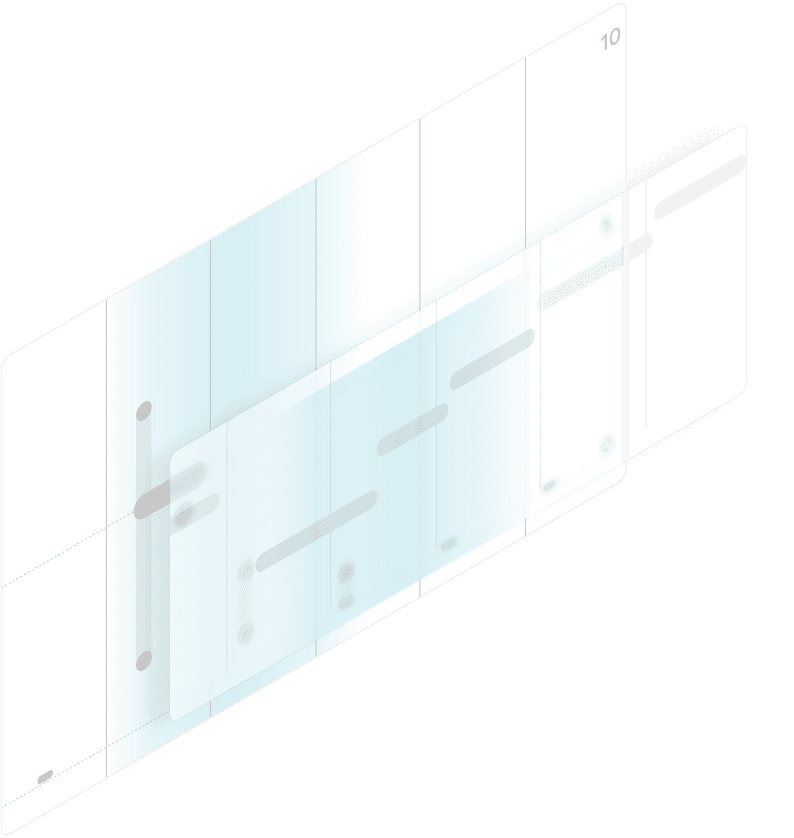
Preserving context across timeline views is a common challenge in interface design. Timelines represent sequences of events in chronological order and can vary in complexity. A basic timeline might display event types, counts, and order, while more complex timelines include details such as timing, duration, and overlap of events. Transitions between these views often risk compromising information continuity, visual stability, and variable correlations. For example, moving from a broad overview of health events to a more detailed view can disorient users. Without careful design, such transitions may lead to a loss of context, making it harder for users to understand how individual events relate to their overall health journey.
Given a timeline story comprised of a sequence of narrative points, there may not exist a single timeline design that adequately communicates all of these points; as a consequence, a storyteller might incorporate multiple timeline designs into a single story.
(Brehmer et al., 2017).

Balancing
A central tension in health-data interfaces lies between structure and openness. Reader-driven approaches offer high levels of interactivity, enabling users to explore and interrogate their data independently. While empowering for analytically inclined users, such freedom can overwhelm others, leading to confusion or misinterpretation.
Conversely, author-driven interfaces present curated narratives with limited interaction, reducing cognitive load but constraining discovery. While structure is essential for usability, overly rigid systems risk flattening the richness of individual experiences.
A considered design approach must therefore negotiate a balance between guidance and adaptability (Chen et al., 2020). Interfaces should provide clear, legible structures while remaining flexible enough to support unanticipated inquiries through familiar interaction patterns—such as filtering, layering, and temporal alignment.
This raises several guiding questions for the design exploration that follows:
What forms of inquiry best support meaningful patient–doctor communication?
How can interfaces balance exploratory freedom with intuitive legibility?
How might systems resurface meaningful patterns from long-term data, including connections users did not explicitly seek?
Design Goals
There is not one singular timeline view to ideally present the information necessary to answer these questions, thus, adopting different representations might be necessary. Drawing from invaluable principles of data storytelling, I am exploring various dynamics rooted in fundamental spheres of prior work encompassing temporal logic, and temporal visualisation.
This framework outlines the theoretical underpinnings of the visual design process, providing a structured approach to bridge the gap between visual analytics and narrative frameworks rooted in storytelling principles. The goal is to create meaningful, context-oriented visual dialogues that enhance the understanding and interpretation of health data.
The correspondence between visual analytics and storytelling has been conceptualised to address the following key objectives:
Transform large, complex data entries into dynamic and easily interpretable information visualisations.
Break data silos by integrating disparate sources into a unified timeline, enabling the contextualisation of events as they unfold.
Facilitate comprehension of both single-point events and interval-based events within their temporal and relational sequence.
Develop varying levels of immersion that allow users to analyse and interact with information at different degrees of detail, balancing high-level overviews with deeper explorations.
Visual storytelling
Visual storytelling can be understood as a strategy for mediating between the complexity of health data and the limits of human interpretation. Within health-tracking systems, it offers a way to reason about the interplay of multiple variables (Segel, 2010) while organising these variables into coherent narratives that reflect robust models of reality (Mayr & Windhager). By situating information within a shared temporal and spatial frame, storytelling enables fragmented data points to be examined as part of an evolving account, supporting interpretive engagement and the identification of relational patterns over time.
From this perspective, visual storytelling is of particular interest as a representational medium for thinking about patient–clinician communication. By providing anchoring elements that connect events across time, such representations may support the articulation of symptoms and experiences beyond verbal recall alone, while offering clinicians a shared reference for interpretation. Rather than prescribing outcomes, this framing highlights how visual narratives can function as intermediaries—structures through which meaning, context, and experience are negotiated in clinical settings (Domin, 2021; Lupton, 2021; Melbye et al., 2020).
To know someone or something is to know their story, and to be able to join that story to one’s own.’
(Ingold, 2011: 161)
A visual medium
On one hand, a visual medium can support patients in articulating their symptoms and emotions with increased clarity and confidence; on the other, they provide clinicians with a shared factual foundation, inviting them into a relatable, patient-centered narrative. This mutual understanding has the potential to enhance diagnostic accuracy, treatment adherence, and overall clinical care (Domin, 2021; Lupton, 2021; Melbye et al., 2020).
At the outset of this essay, I invited you to recall a moment when you shared a complex story for the first time—did your words capture its depth, and did you feel assured that your doctor fully grasped its meaning?
This is precisely the purpose such a tool should serve: to provide immersive snapshots of time that make personal experiences tangible. By transcending the limitations of active recall and verbal communication, these tools offer quick, intuitive overviews of layered health information, transforming fragmented data into coherent narratives that enhance patient confidence (Schröder et al., 2023). In doing so, they may cultivate deeper, more informed relationships between patients, clinicians, and caregivers (Vaughn et al., 2021).
— Narratives provide structure to what we record and share, helping us develop a subjective and contextual understanding of our state over time.
The challenge, then, is not one of representation capacity but of narrative legibility. As health data accumulates across time and sources, the risk is not scarcity but fragmentation—where experiences lose their continuity and events their relational meaning. The design explorations that follow investigate how visual forms might resist this fragmentation, offering ways to hold experiences together without flattening their complexity.
The discussion above suggests that challenges in personal health communication are less a matter of data availability than of representational coherence. As health information accumulates across heterogeneous sources and extended periods of time, the central difficulty lies in maintaining narrative legibility—ensuring that events, experiences, and contextual factors remain intelligible in relation to one another rather than dissolving into fragmented records.
From this perspective, no single timeline or representational model can adequately capture the range of temporal relationships involved in lived health experiences. Instead, it becomes necessary to consider multiple representational perspectives informed by prior work in temporal logic, temporal visualisation, and data storytelling. These perspectives do not aim to resolve complexity, but to make it navigable and interpretable.
Within this technical inquiry, the relationship between visual analytics and storytelling can therefore be articulated through a set of speculative design goals:
To explore how large and heterogeneous health data sets might be rendered interpretable without collapsing them into reductive summaries.
To examine how disparate data sources may be situated within shared temporal structures, allowing events to be understood relationally as they unfold.
To consider how both momentary events and extended intervals can be represented within their temporal and narrative contexts.
To reflect on how different levels of temporal focus may support distinct modes of interpretation, ranging from broad overviews to more detailed inquiry.
These goals do not prescribe specific solutions, but delineate a design space in which questions of time, narrative, and representation can be explored. They form the conceptual basis for a separate visual design proposal, where the issues raised in this essay are investigated through concrete representational experiments and interface structures.
Themes:
Digital Health, User Experience, Interface Design